|
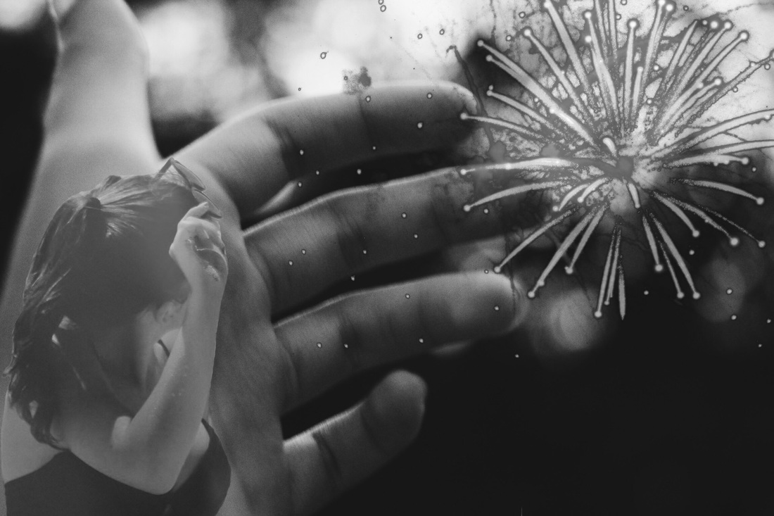
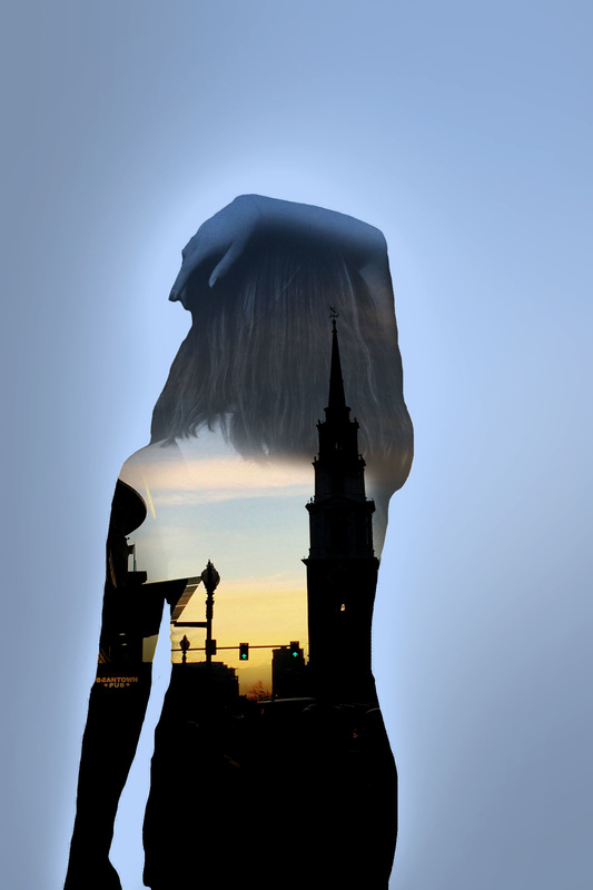
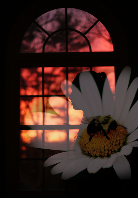
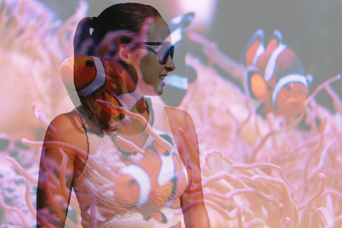
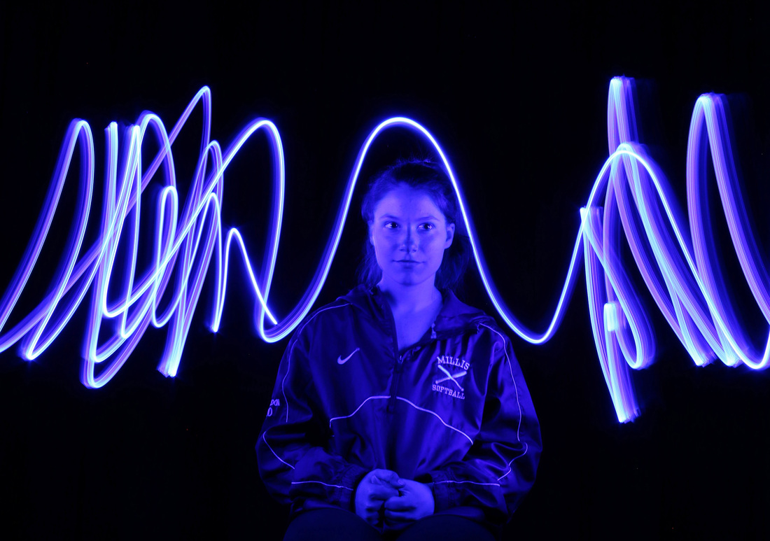
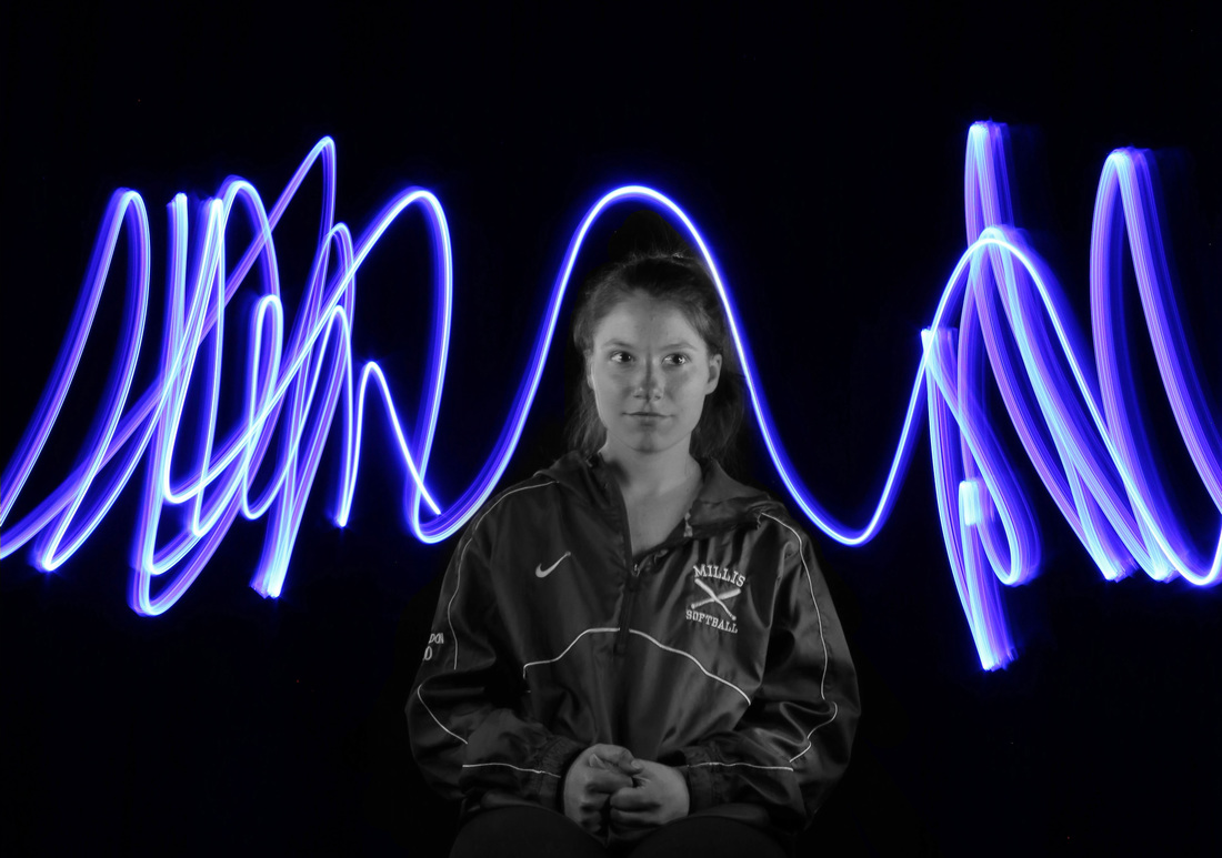
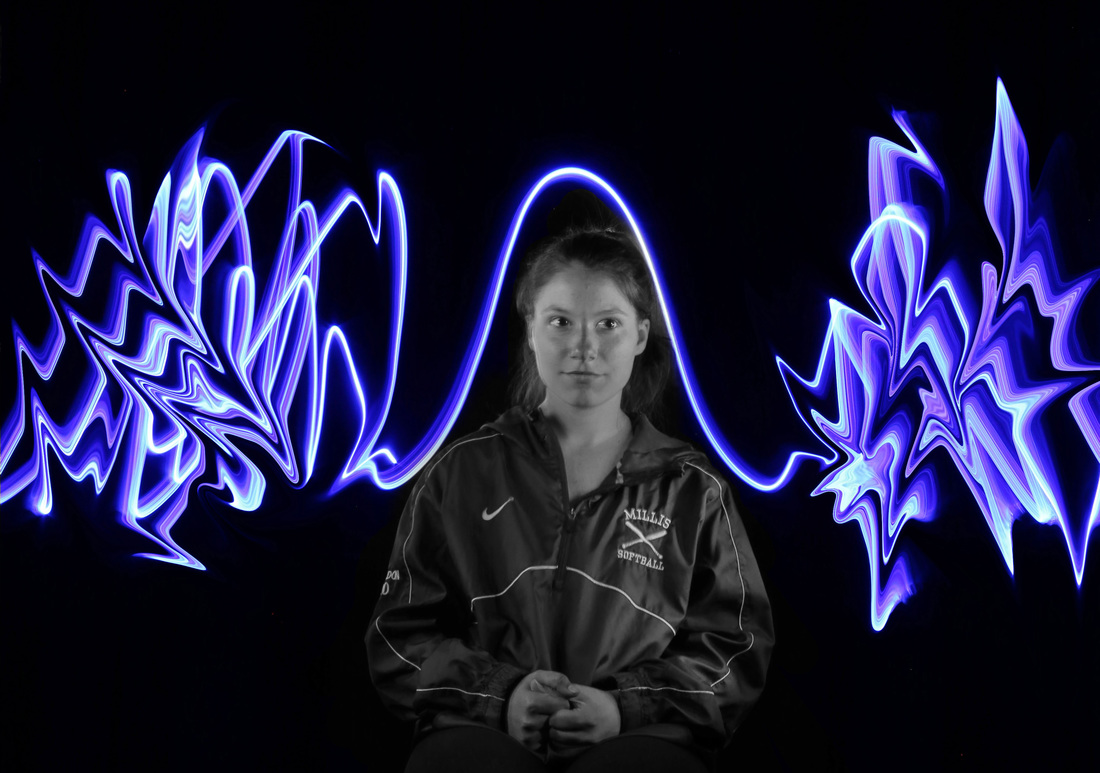
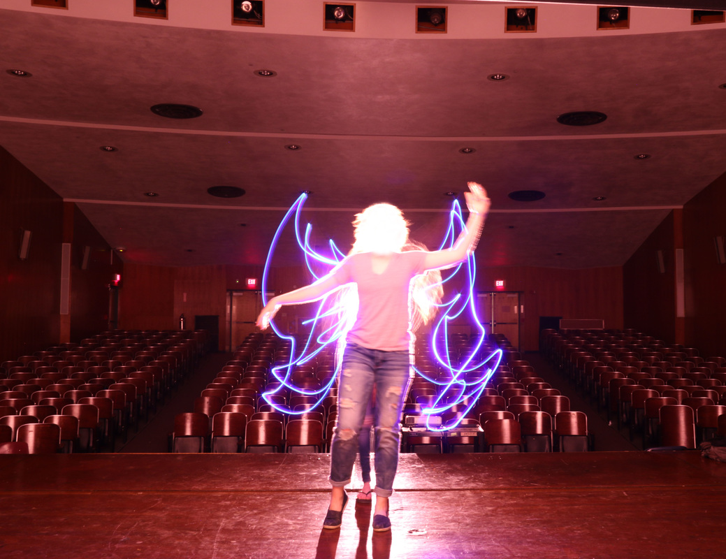
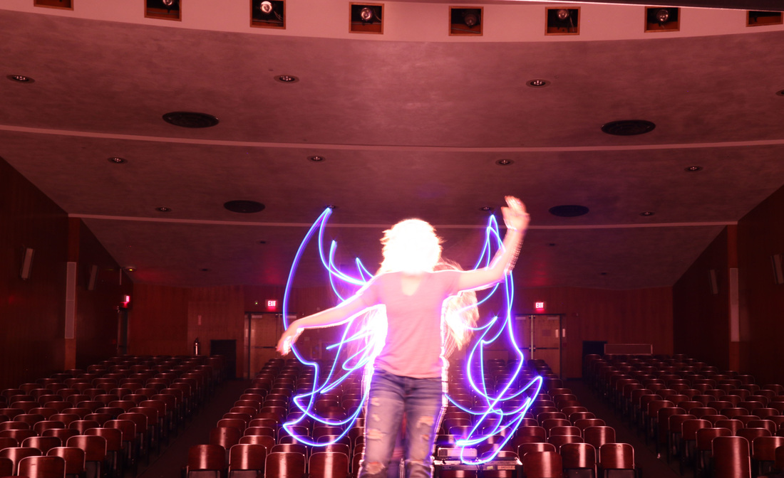
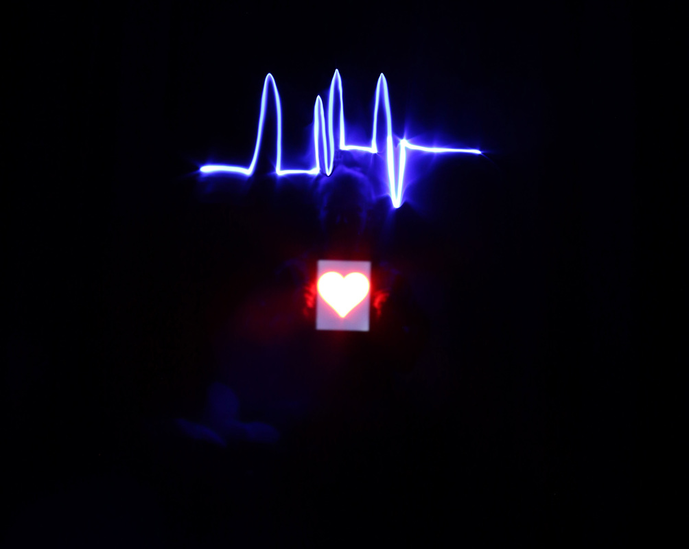
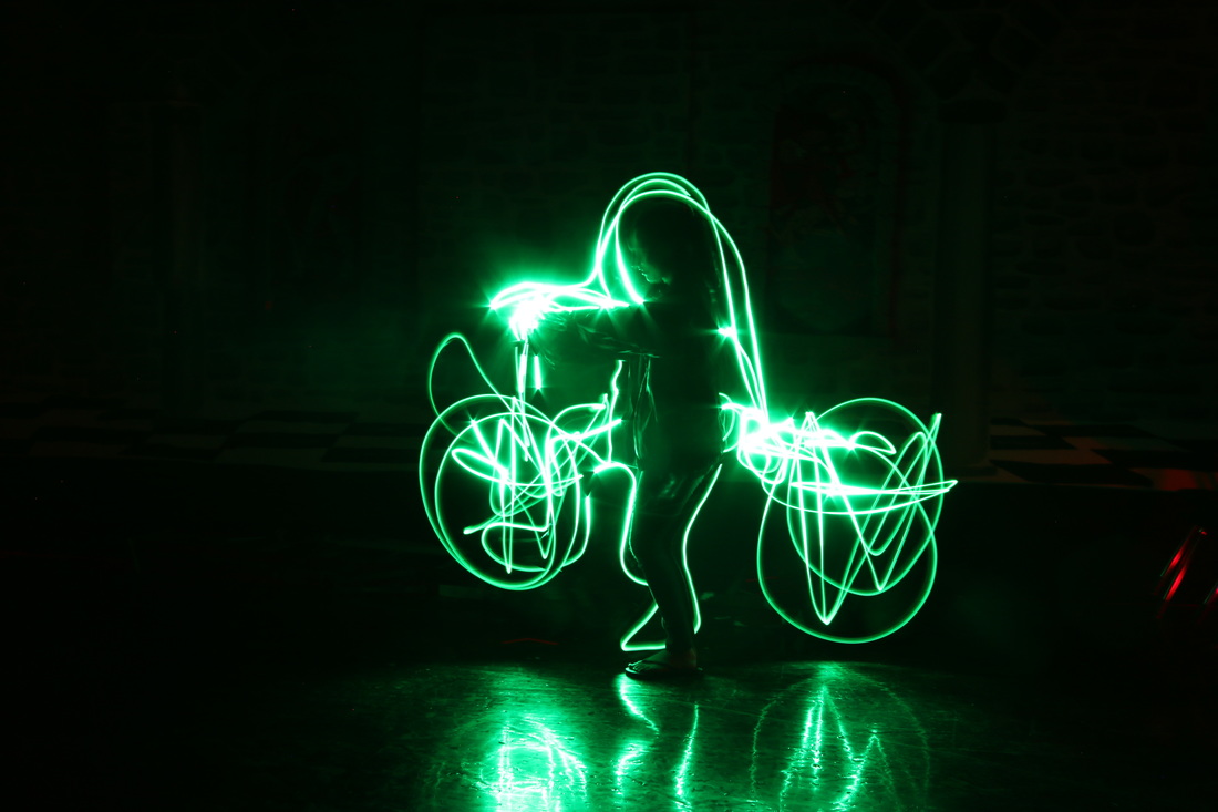
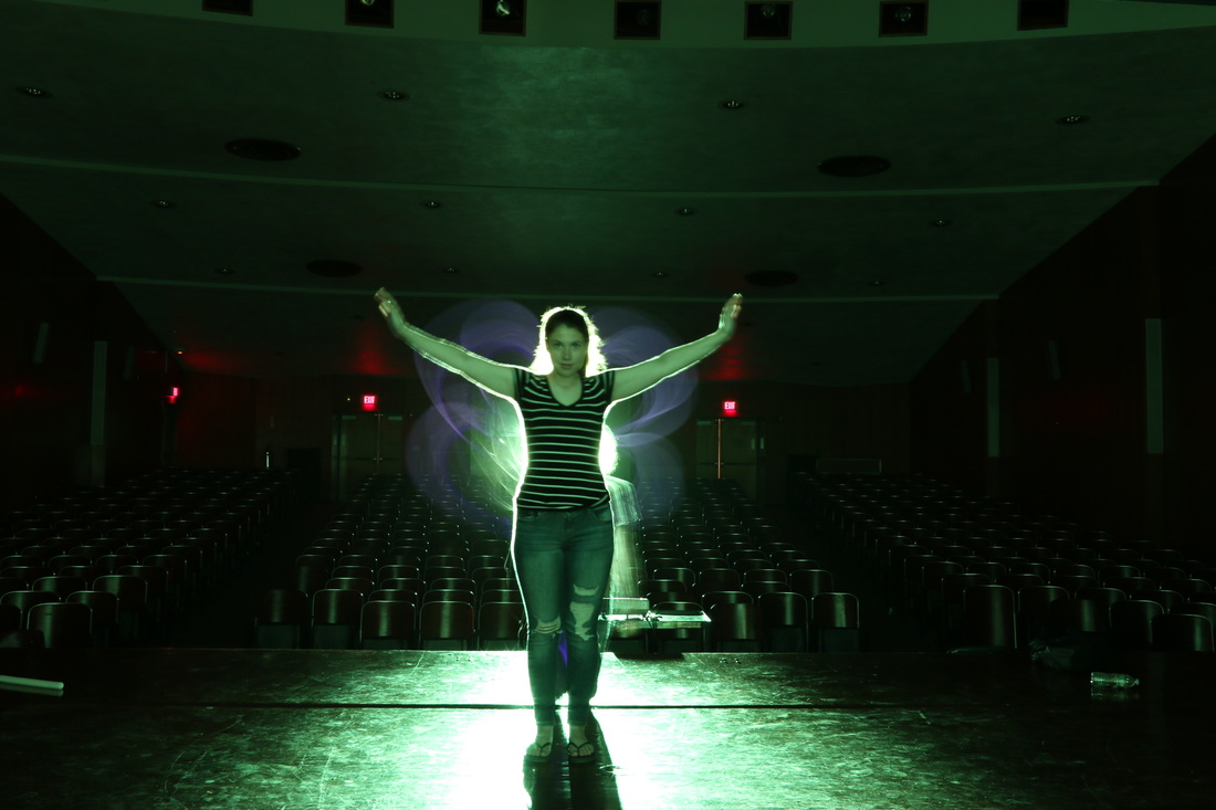
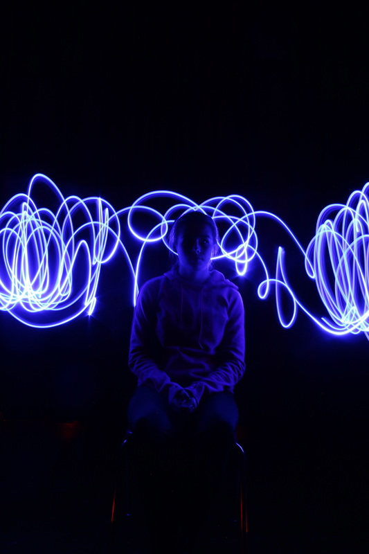
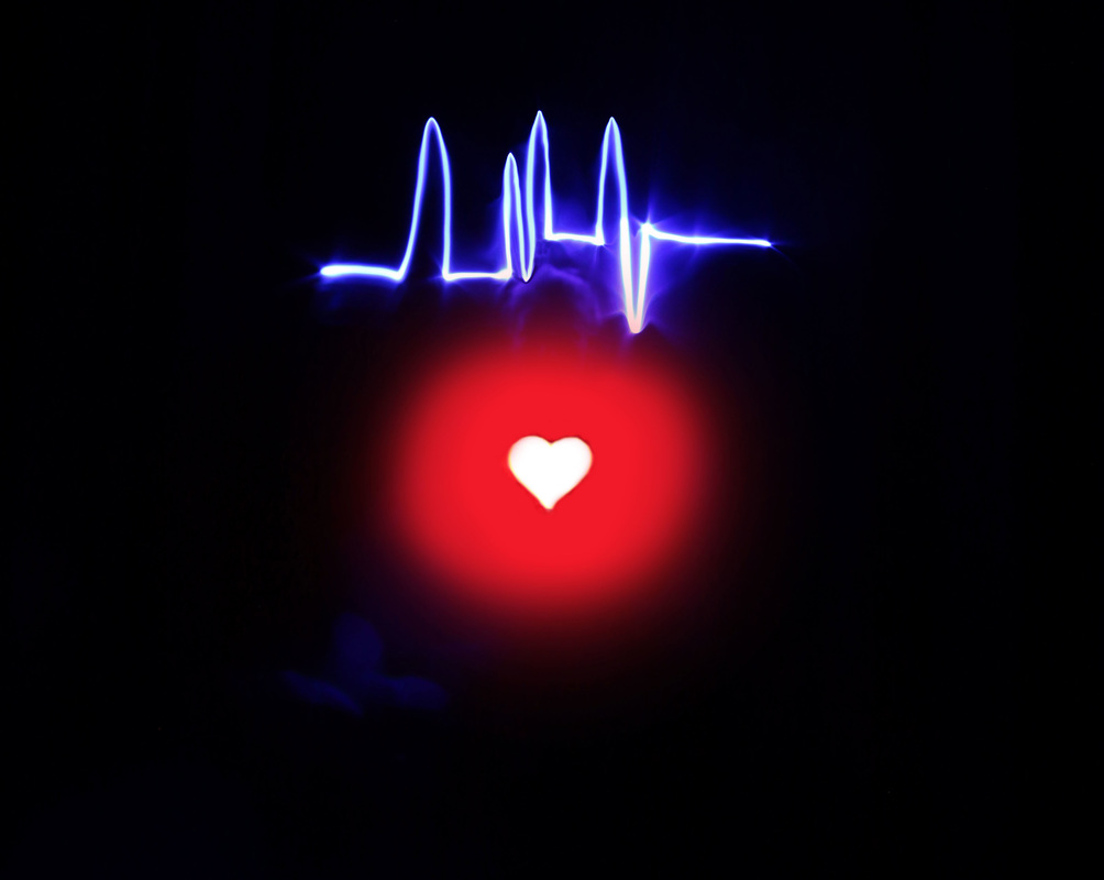
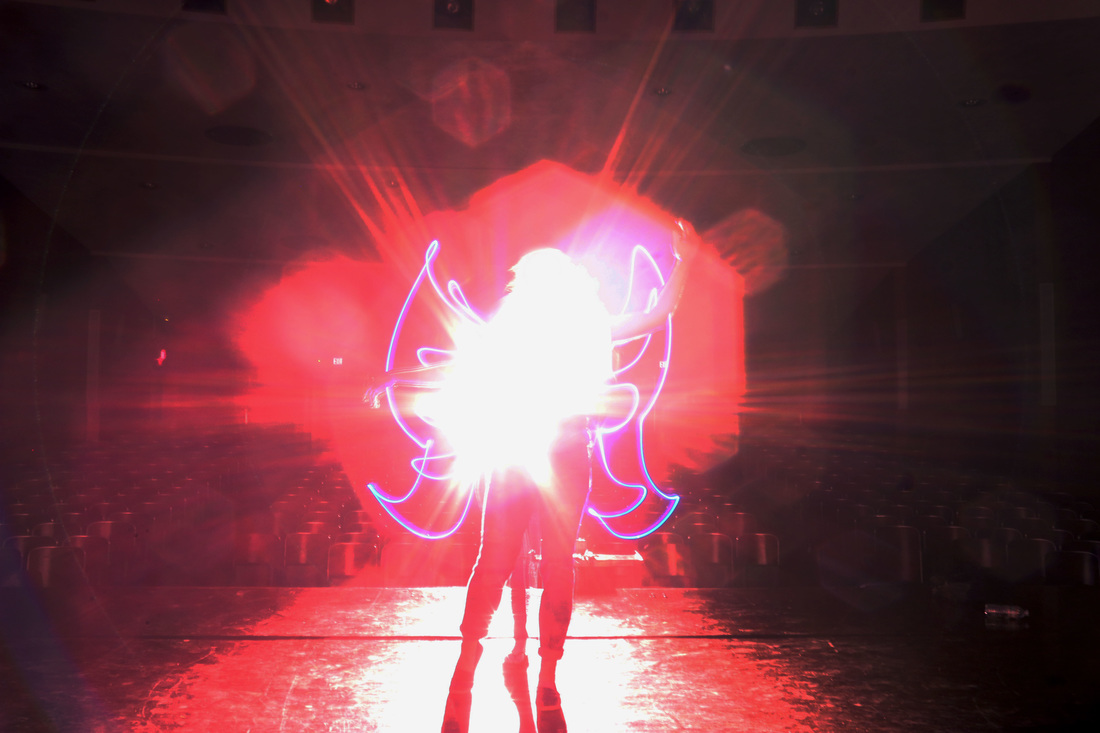
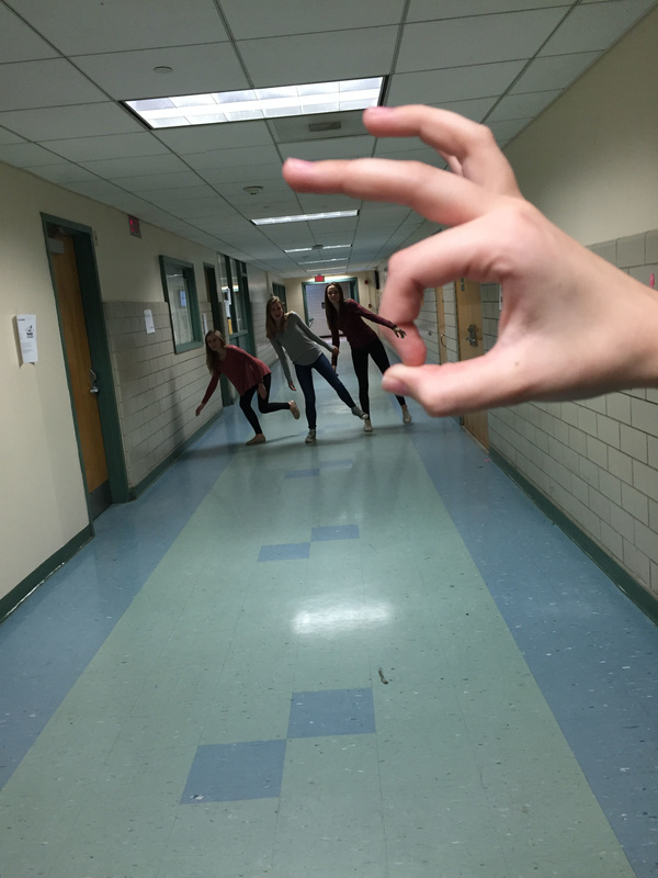
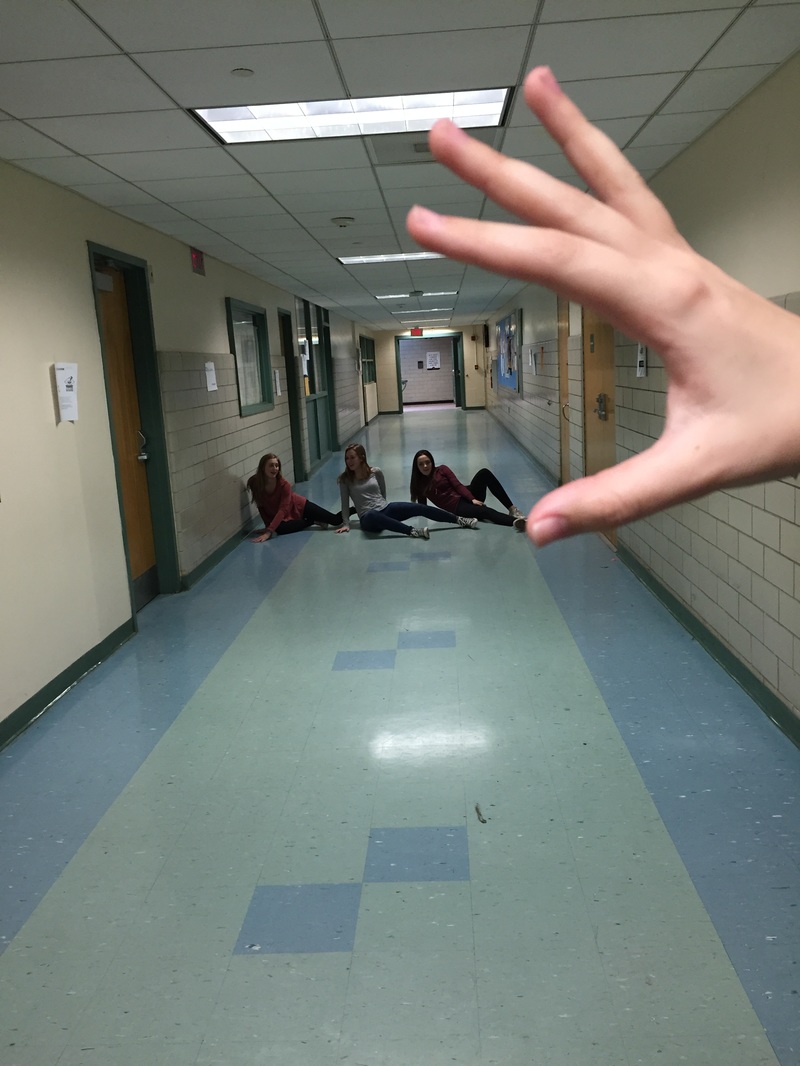
These are the photos I came up with for my double exposures. The second two were just created by layering images and turning down the opacity. The first one is the same, but with some erasing and more images. The second picture was created by following a Youtube tutorial. That one came out the best.
I think some street art is very interesting, but others can be harmful. It kind of depends on the situation of the art, but I think most big cities would not be the same without it. Millis has some, but it's not quite popular here. Sometimes it is vandalism, but sometimes it's art. If someone got caught doing it they'd probably go to jail. If my walls were painted with graffiti without my consent I might be mad. It would kind of depend. If I lived in the city I mean I might kind of expect it, but if it wasn't visually appealing or if it was something rude I think I would be kinda upset. If it was something I liked though I might be happy with it. The main point of the movie "Exit Through The Gift Shop" was that consumers buy into anything nowadays. Mr. Brainwash appeared in days and made so much money off of stuff he was having others mass produce. It also made the point that street art conveys powerful messages and can spread movements rapidly throughout the world even (with the help of the internet). I don't think it matters if the whole thing was staged by Banksy. The point he made was clear, and spread the message.
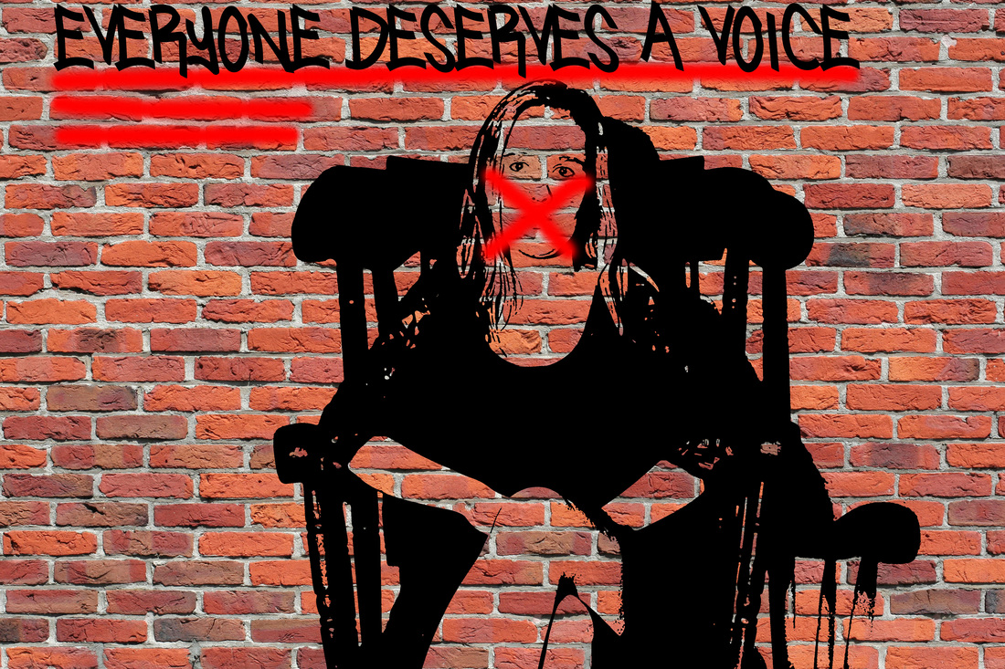
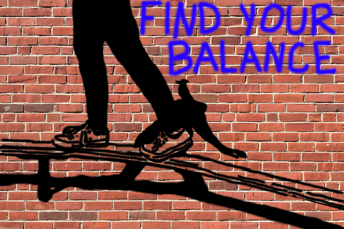
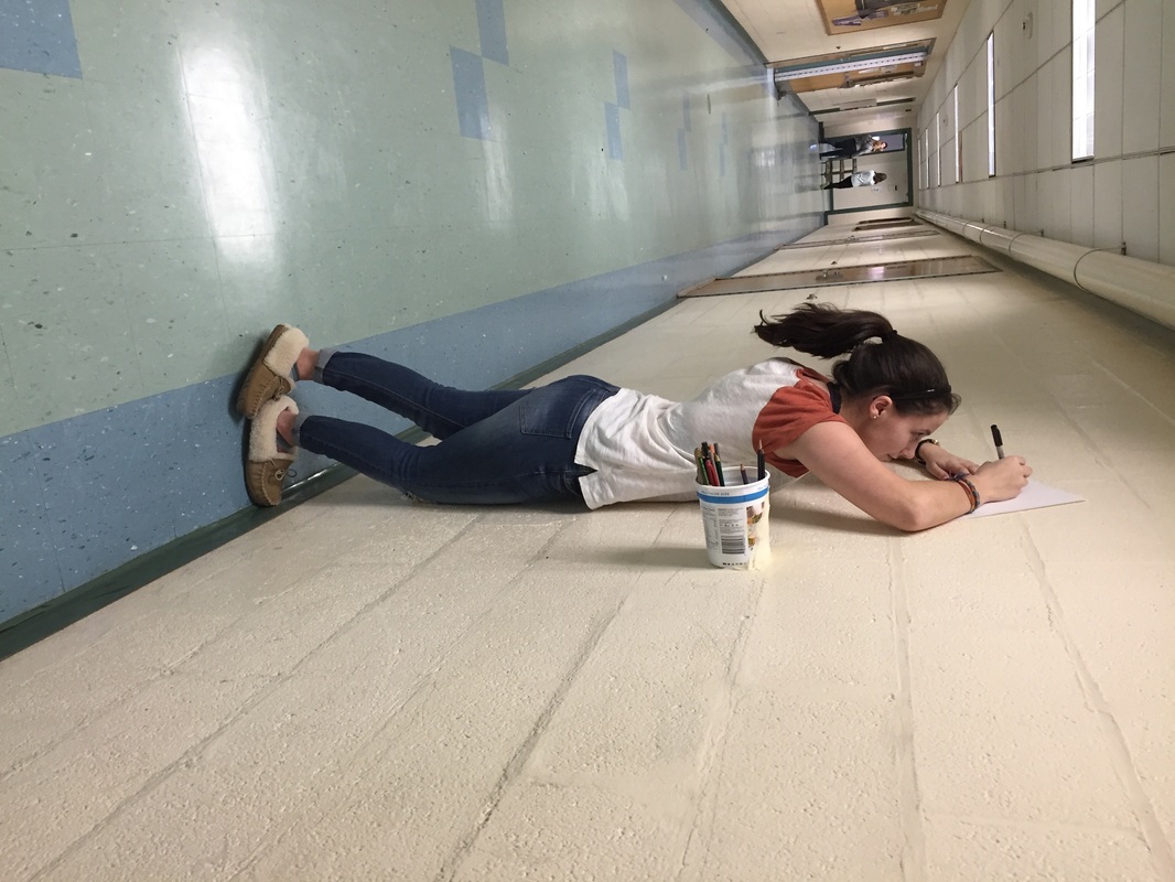
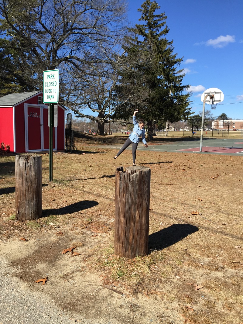
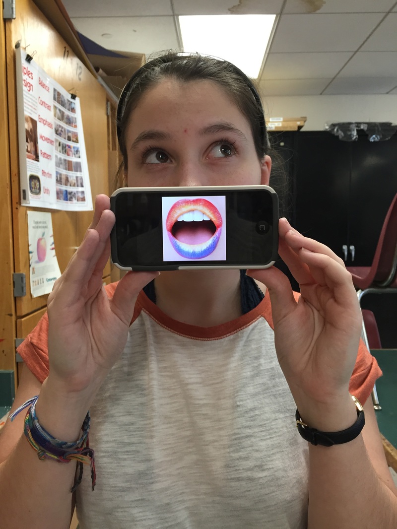
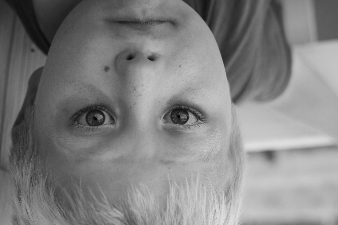
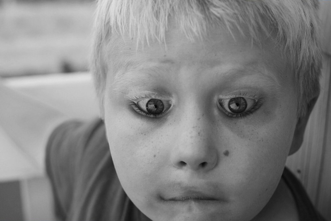
My thoughts kind of line up with "It is art, but there should be specific places to create it", "It is definitely art and it should be celebrated" and "It reflects the culture of youngsters in the society". In Photoshop I created two pieces. One conveys the idea that everyone deserves a voice. It shows a girl sitting in a chair, silent, with an "X" over her mouth. This is an important message because in society many people are denied their right to speak and share. My second image shows someone on a balance beam balancing, and says "Find your balance". This image shows how in life there is a balance to everything, and to succeed and not fail (or fall), you must find that balance. Each picture was taken from an angle that would allow it to look like I was holding something, people were standing/sitting, that people were falling, or something along those lines. The last picture I used is a photoshop I did where I flipped the yes and mouth.
Hockney Cubist Style Edit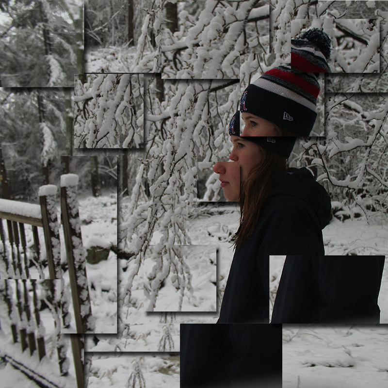 Butterfly Effect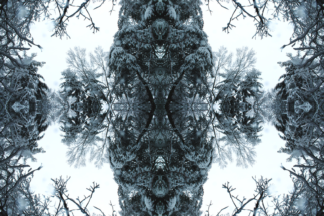 Kaleidoscope Effect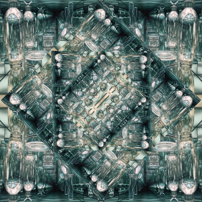 We watched a short video describing why David Hockney created joiners. He created his “joiners” to show a passage of time. He would take pictures of what was in front of him and combine them together in a collage of sorts. To create my cubist image I used different parts of the image, selected them into shapes, and then copied that selection and shifted it. Then after doing that with all the portions I wanted to do it with, I added a drop shadow to each layer. For the butterfly effect image I took a photo, and doubled the canvas size first. Then I copied the layer and dragged the copy down using the top arrow, and completed that with each side. For the kaleidoscope effect I first did the butterfly effect, then cropped it into a square. After that I rotated and shifted a copy of the layer 45*, making the layers progressively smaller. Hockney Style Joiner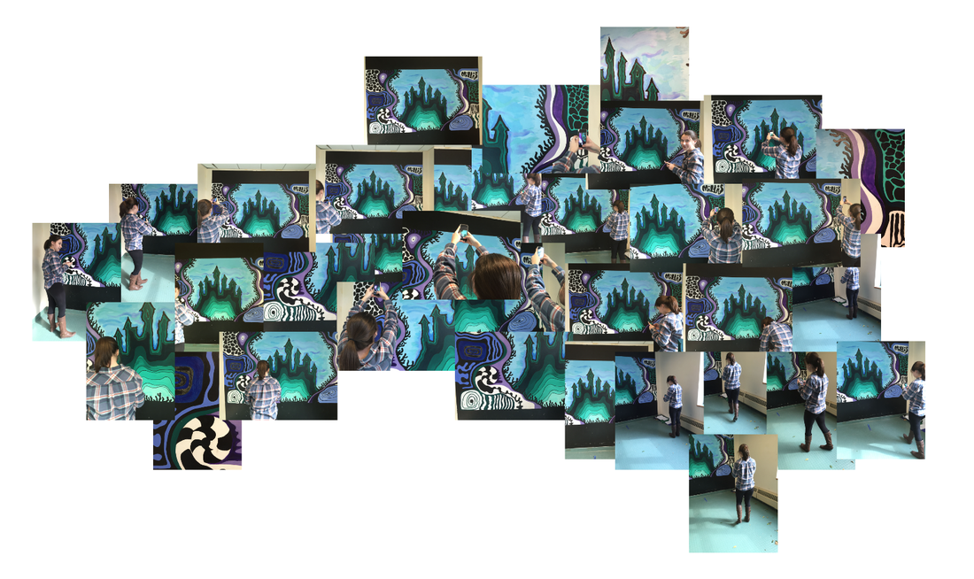 This final image of the series was in the style of Hockney. To create it I took a myriad of photos and combined them together in photoshop. Especially in the bottom right corner it shows movement and the passing of time. It's of Amanda taking photos of the mural.
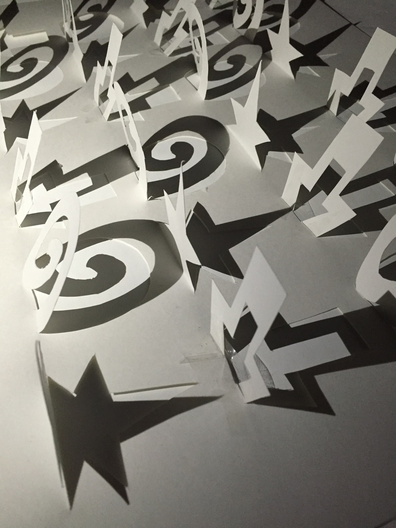
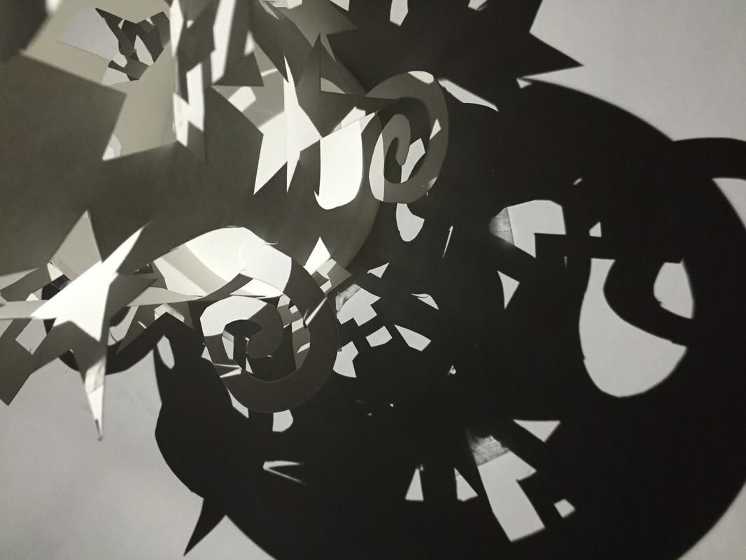
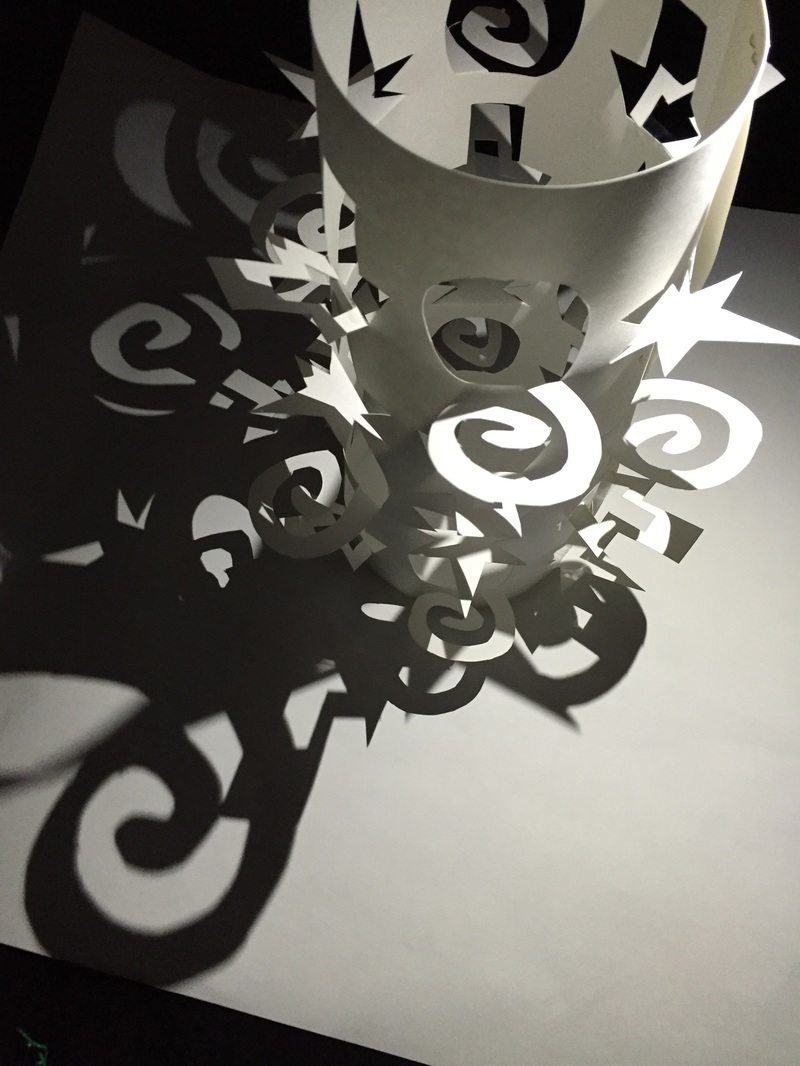
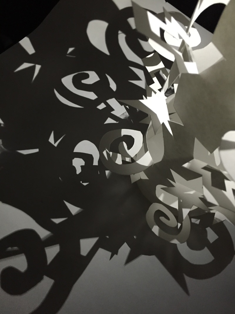
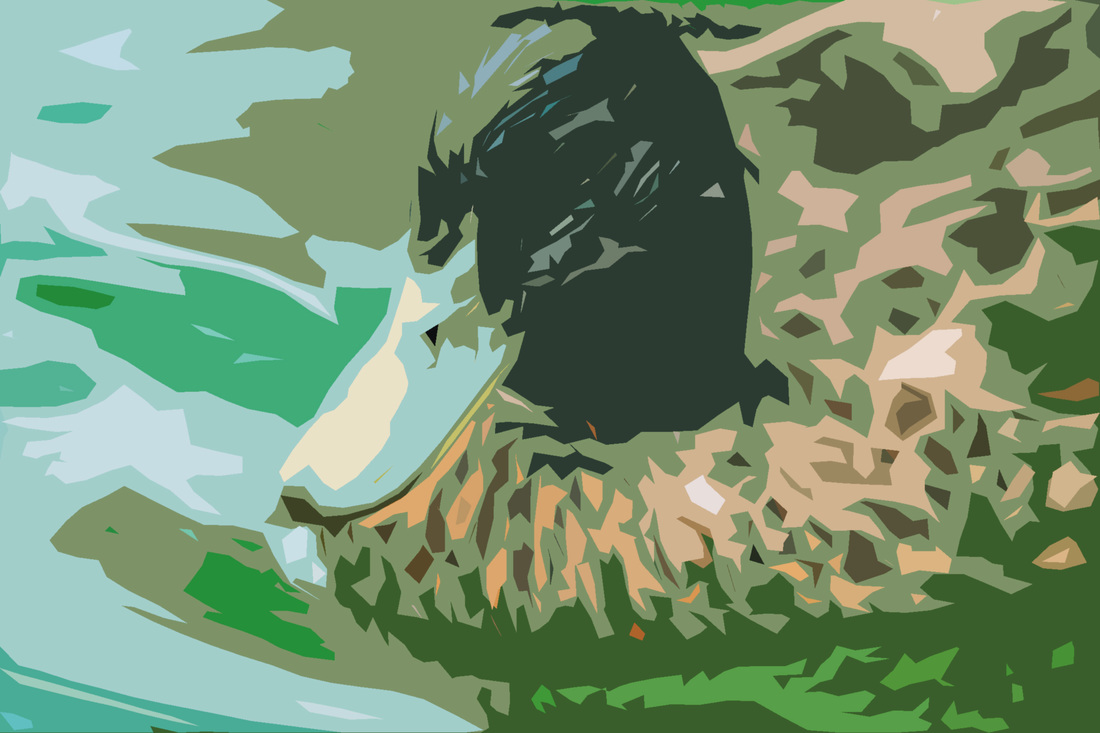 This is my gradient for the painting. 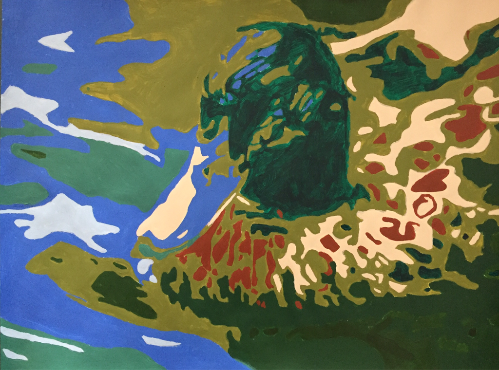 This is my gradient painting.To make this lantern first I had to create a template in Adobe Illustrator out of shapes. Then I had to print that out and cut it out onto a piece of oak tag using an exacto knife. We set up a black felt backdrop but ended up putting a white piece of paper under the flat paper and lanterns for a better shadow effect. The light source I used was my friends phone, and i had her hold it at different angles to get the shadows I liked. I showcased light modulation but playing around with the shadows and trying to get cool shadows and good contrast.
|
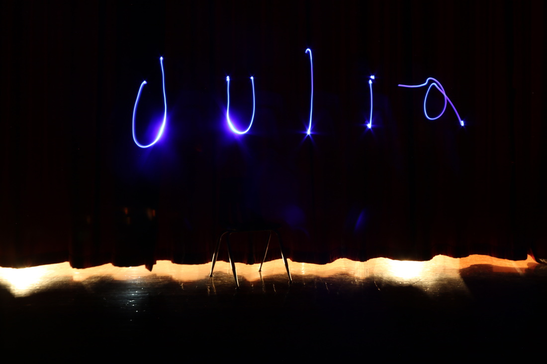
AuthorHi, my name is Julia. I'm a junior in high school. This is my blog for my AP 2D Design art class in school. I am focusing on photography for my portfolio. Archives
June 2017
Categories |


 RSS Feed
